
Table of Contents
1. Stock Candlestick Basics: The Foundation of Chart Reading
When people start investing, they often skip stock candlestick basics—the most fundamental building block of a chart—and jump straight into moving averages or RSI1 The problem is that every candlestick packs four pieces of price data into a single shape: where the price started, how high it climbed, how low it dropped, and where it ended up.
Without This, a Chart Is Just a Picture
A daily candle compresses an entire day of trading into that one shape; a 5-minute candle does the same for five minutes. Learning to read a candlestick really means learning to read the tug-of-war between buyers and sellers during that period. Skip this step, and every technique you learn afterward will rest on shaky ground.
Structure: What’s Inside a Candle
Every candlestick — no matter the timeframe — encodes the same four prices.
| Component | Meaning |
| Open | The price at the start of the period |
| High | The highest price reached during the period |
| Low | The lowest price reached during the period |
| Close | The price at the end of the period |
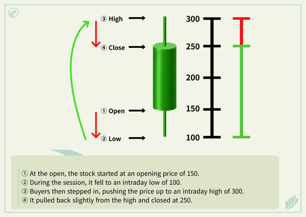
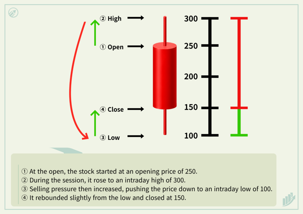
A daily candle shows the open, high, low, and close for one day. A 5-minute candle shows the same four values, just compressed into five minutes. Only the timeframe changes — the logic stays identical.
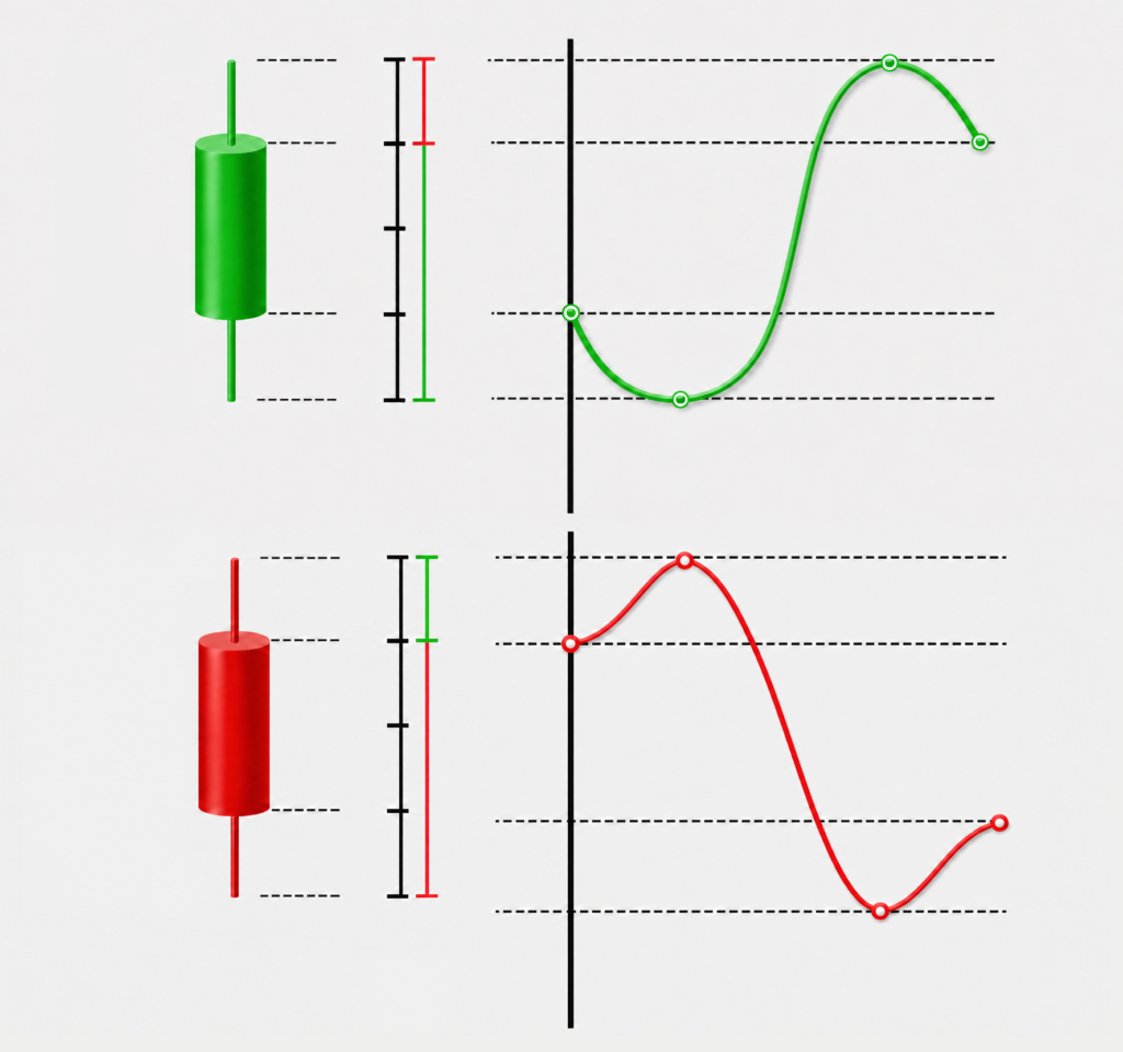
The Body : The Gap Between Open and Close
The thick rectangular part of a candlestick is called the body. It visualizes the distance between the open and close, and gives you a quick sense of which side had more control during that period.
- Bullish candle : Buyers had the upper hand—the close was higher than the open.
- Bearish candle : Sellers had the upper hand—the close was lower than the open.
A bullish candle isn’t automatically good news, and a bearish candle isn’t automatically bad news. A bullish candle after a long downtrend near a low means something completely different from a bullish candle appearing right after a sharp rally near a high.
Where a candle forms often matters more than whether it’s bullish or bearish. Body size is also important. A large body usually means one side had a clear advantage; a small body means buyers and sellers were more evenly matched. A big bullish body shows strong buying pressure pushing price up, while a big bearish body shows strong selling pressure pushing it down. A tiny body, on the other hand, signals indecision — the market hasn’t picked a direction yet.
Wicks : Signs of Price Rejection
The thin lines extending above and below the body are called wicks, also known as shadows. From here on, we’ll just call them wicks. While the body shows the move between open and close, the wicks reveal how buyers and sellers fought back during the period.
- Upper wick : Price moved higher but was pushed back down.
- Lower wick : Price moved lower but was pushed back up.
- Little to no wick : Price closed near one end of the candle’s range, suggesting stronger control by one side.
Wicks are best judged in relation to body size rather than in isolation. A long upper wick suggests price rejection and selling pressure at higher levels, while a long lower wick suggests buying pressure at lower levels. But the meaning still shifts depending on where that candle appears — near a low, near a high, inside a trading range, or mid-trend.
Where Stock Candlestick Basics Lead You Next
Context and Sequence Are Everything
Judging direction from a single candlestick is risky — the same bullish candle can mean entirely different things depending on context. When reading a candlestick, build the habit of checking three things together:
- Did the candle close above or below the previous close?
- Is the body larger or smaller than recent bodies?
- Which wick is longer—the upper or the lower?
And just as important: where did this candle form? A long lower wick near the bottom of a downtrend can signal a potential reversal. The same lower wick appearing mid-uptrend might just be noise.
Volume adds useful context. A strong bullish candle with a volume spike suggests more active buying, while one on low volume may represent a weaker or temporary bounce.
A single candlestick captures where countless market participants bought and sold within a short window of time. Once you can read that, a chart stops looking like a random graph and starts looking like a record of buying and selling behavior.
Candlesticks do not predict the future. They show the balance between buyers and sellers based on price action that has already occurred.
In the beginning, it’s enough to simply tell bullish and bearish candles apart. From there, layer in body size, wick length, where the candle formed, and its relationship to volume — one at a time. Knowing a long list of advanced techniques matters far less than mastering stock candlestick basics accurately. That habit is the real foundation of chart analysis.
The quick checklist : candle type → body size → wick length → location → volume. Master that sequence, and you’ll already be reading charts far more systematically than most beginners do.
- RSI (Relative Strength Index) is a momentum-based oscillator that operates on a scale from 0 to 100. A value closer to 0 indicates weaker momentum in price movement, while a value closer to 100 indicates stronger momentum. This indicator quantifies the strength of current price momentum by comparing the magnitude of price gains and losses over a given period. ↩︎